Wayfinding Signage Design for NID Aspirants: A Beginner’s Guide to Clear Navigation
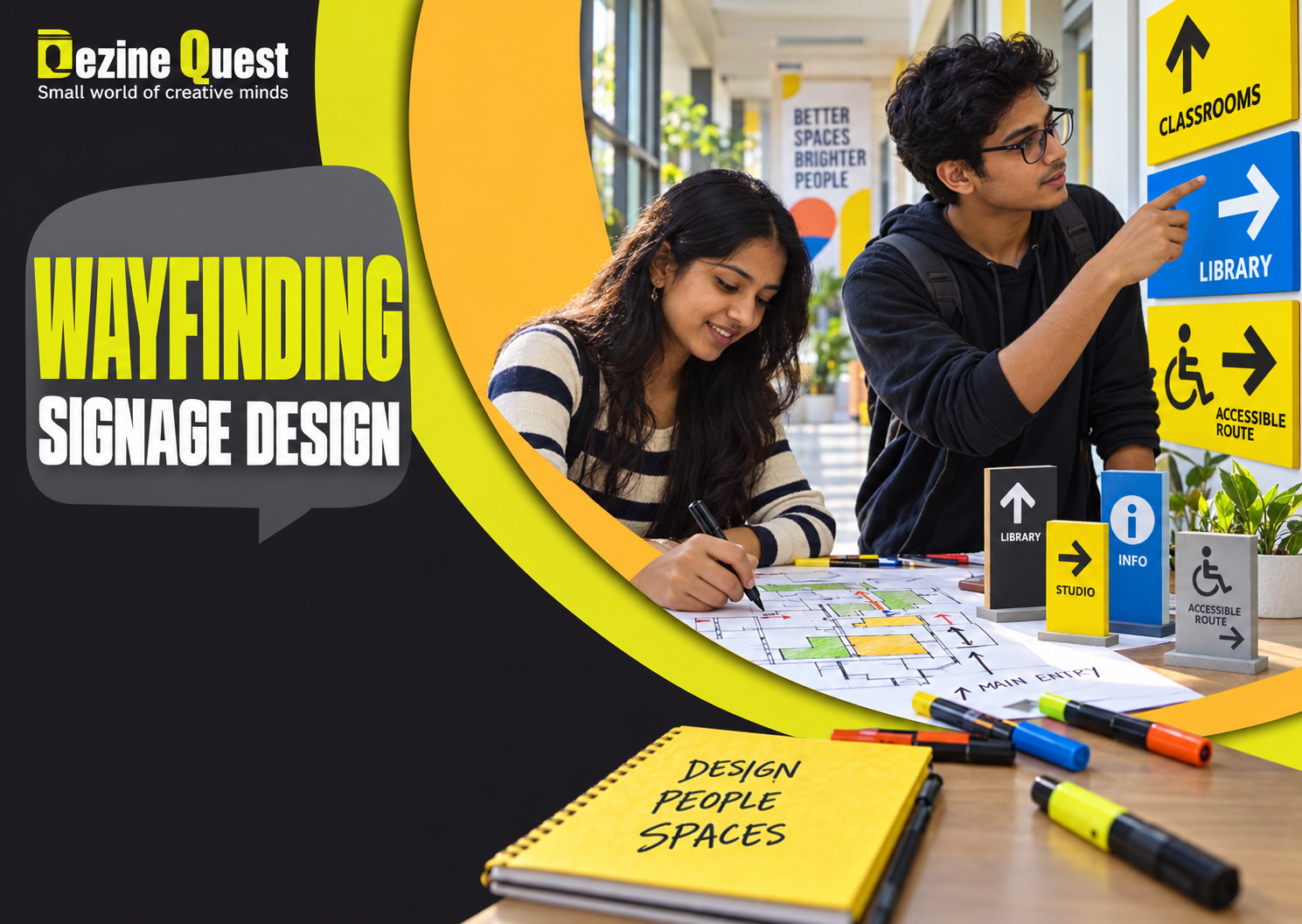
A visitor enters a busy campus building and needs to find the design studio. Three corridors look alike. One sign points left, another uses an unfamiliar symbol, and the room numbers are hidden behind a door. The visitor is not confused because the building is complicated alone; the information system is also failing. Designing a clearer route is an accessible introduction to wayfinding: helping people understand where they are, where they need to go, and what to do next.
For students exploring NID entrance coaching, wayfinding is a practical visual communication exercise. It brings together observation, empathy, pictograms, lettering and testing. This article is a skill-building guide, not a claim that a particular signage question will appear in NID DAT.
What Is Wayfinding Design?
Wayfinding is the system of cues that helps people navigate a physical environment. Signs are only one part of it. Landmarks, colour zones, building layout, floor markings and consistent naming can all contribute. A good wayfinding system helps someone make the right decision at the right moment, especially at entrances, junctions, lifts and staircases.
Imagine a library with three floors. A useful sign near the entrance might first identify the floor, then direct visitors to reading rooms, circulation and accessible facilities. Repeating the same message on every wall creates clutter; placing a clear instruction at the decision point is usually more helpful.
Start With a Real User, Not a Decorative Sign
Choose a realistic user: a first-time visitor, a child, an older adult, or someone carrying luggage. Ask what they know on arrival and what they need to find. A student familiar with the campus may overlook confusing turns that a new visitor notices. Empathy in design begins by noticing that gap.
Write a simple scenario: “A parent arrives at the reception and must locate the auditorium without asking for help.” Mark the starting point, destination and any possible wrong turns. Keep the task small enough to study in one session.
Exercise 1: Map a Route Before Designing
Draw a basic floor plan of a familiar building, such as a school, library or clinic.
Mark the entrance, destination, stairs, lift and important intersections.
Walk the route and note where a visitor must choose a direction.
Place a potential sign only at the points where information is needed.
Ask a classmate unfamiliar with the route to explain the path using your draft.
This exercise teaches a valuable lesson: adding more signs is not always the answer. Better placement and consistent naming may solve the problem more efficiently.
Exercise 2: Build a Clear Information Hierarchy
A directional sign often needs a destination name, an arrow and sometimes a pictogram. Decide which information should be read first. Make the destination label prominent and use short, familiar words. Avoid long sentences, decorative slogans and several competing arrows on the same small panel.
Create two versions of a sign for “Auditorium — Level 2.” In the first, make the level number largest. In the second, make “Auditorium” the headline and place the level beneath it. Ask a viewer which sign communicates the destination more quickly. Record the result rather than assuming your preferred design wins.
Exercise 3: Draw Pictograms That Work at Small Sizes
Pictograms are simplified symbols for destinations or services. Start with a common location such as drinking water, washroom, stairs or information desk. Draw three variations using basic geometric shapes. Reduce each sketch to a thumbnail and check whether the meaning survives. If a symbol needs a paragraph of explanation, it may be too complex for quick navigation.
Do not assume that every symbol is universally understood. Symbols can vary across cultures and contexts. When possible, pair unfamiliar icons with clear words and test them with people who did not help create the design.
Exercise 4: Make Arrows Consistent
Use a consistent arrow style and direction convention throughout a small signage set. Draw signs for straight ahead, left, right and up one floor. Test whether the placement of the arrow beside the text changes interpretation. For a route that includes stairs or lifts, use an explicit level label rather than expecting the arrow alone to communicate the entire journey.
Exercise 5: Design for More People
Inclusive wayfinding considers readable type, strong contrast, placement and multiple ways to understand directions. Colour can help distinguish zones, but colour alone should not carry essential meaning. Consider visitors with low vision, limited literacy or mobility needs. A route marked only by stairs is not a complete solution for someone who requires step-free access.
For practice, redesign a fictional clinic sign that uses pale yellow text on white and a tiny arrow. Increase contrast, simplify wording, and include the accessible route where relevant. This is a design-thinking exercise; actual public signage should follow applicable accessibility and safety standards.
Exercise 6: Test the Sign Without Explaining It
Show a draft sign to three people for five seconds. Ask: “Where would you go?” “What do you think this symbol means?” and “What information is missing?” Do not tell them the intended answer first. If viewers disagree, note whether the issue comes from wording, icon meaning, arrow position or visual hierarchy. Revise only the part that caused confusion, then test again.
A Seven-Day Wayfinding Practice Plan
Day 1: Observe signs in a familiar public building and photograph or sketch confusing examples where permitted.
Day 2: Draw a route map and identify decision points.
Day 3: Create a three-level information hierarchy for destination signs.
Day 4: Sketch and simplify four pictograms.
Day 5: Build a consistent family of directional arrows and labels.
Day 6: Redesign the system for legibility and inclusive access.
Day 7: Run a small user test and document what changed.
Keep the initial drafts, test observations and revised signs together. This record shows how the design evolved from evidence, not just how the final page looks.
Common Mistakes Beginners Should Avoid
Designing signs before understanding the route and its decision points.
Using colour as the only indicator of direction or destination.
Choosing artistic lettering that is difficult to read quickly.
Inventing unfamiliar symbols without testing comprehension.
Placing too much information on a small panel.
Assuming that the designer’s own familiarity matches the visitor’s experience.
How Wayfinding Connects to Design Entrance Preparation
Wayfinding practice develops observation, problem framing, visual hierarchy and user-centred communication. These are transferable design abilities that may support broader preparation alongside the latest official NID DAT syllabus and assessment guidance. Students comparing NID DAT coaching or design aptitude test coaching can ask whether the teaching includes user observation, visual communication and critique, not only polished drawing demonstrations.
For a beginner, the goal is to explain why a sign works. Being able to defend the placement of an arrow or the choice of a label shows a stronger design process than simply adding decoration.
Explore Design Learning With Dezine Quest
Dezine Quest is a design entrance coaching institute in Patna. Students considering NID coaching in Patna can explore the institute’s published course information and ask about current schedules, creative aptitude exercises, feedback and admission support. Confirm which topics are covered in the present batch rather than assuming a dedicated wayfinding module is included.
Explore the institute: https://www.dezinequest.com/
Explore online classes: https://www.dezinequest.com/online-classes.html
Frequently Asked Questions
Is wayfinding the same as graphic design?
Wayfinding uses graphic design tools such as typography and symbols, but it also involves routes, environments, decision points and user behaviour.
Do I need software to start?
No. A pencil, floor-plan sketch and a few paper sign mock-ups are enough to learn the basic process. Digital tools can help later with consistent production.
Are pictograms always better than words?
Not necessarily. Familiar symbols can be quick to recognise, but clear labels are often essential, especially when a symbol is unfamiliar or ambiguous.
Will NID DAT definitely include a signage task?
No specific question can be guaranteed. Use this activity to develop transferable design thinking and check the current official examination information.
How can I improve a confusing sign quickly?
Identify the exact decision it should support, simplify the message, increase legibility and test it with someone unfamiliar with the location.
Conclusion: Help People Find Their Way
Effective wayfinding is not about decorating walls with arrows. It is about understanding a visitor’s goal and placing clear information where it matters. Start with one route, create a consistent set of signs and improve them through observation and testing. For structured design entrance preparation, explore Dezine Quest’s current courses and ask how visual communication and user-centred design are taught.