Design Entrance Poster Typography: How to Create a Clear Visual Hierarchy
Imagine seeing two posters for the same college exhibition. One uses five different fonts, crowded illustrations and a headline that disappears into the background. The other gives the event name a clear position, separates the date and venue, and uses space to guide the eye. Even without elaborate drawing, the second poster communicates more effectively. That difference is visual hierarchy. For students developing design aptitude, typography is a practical way to learn how information can be arranged for real people.
This guide focuses on lettering, hierarchy and readability rather than repeating general sketching or portfolio advice. These skills can complement NIFT entrance preparation, NID entrance coaching and broader design practice, although no particular poster task is guaranteed in an entrance examination.
What Is Visual Hierarchy in a Poster?
Visual hierarchy is the order in which a viewer notices and understands information. A poster usually has a primary message, supporting details and a final action or reference. Hierarchy can be created through size, weight, contrast, spacing and position. The biggest text is not automatically the best text: it must also be the right information to emphasise.
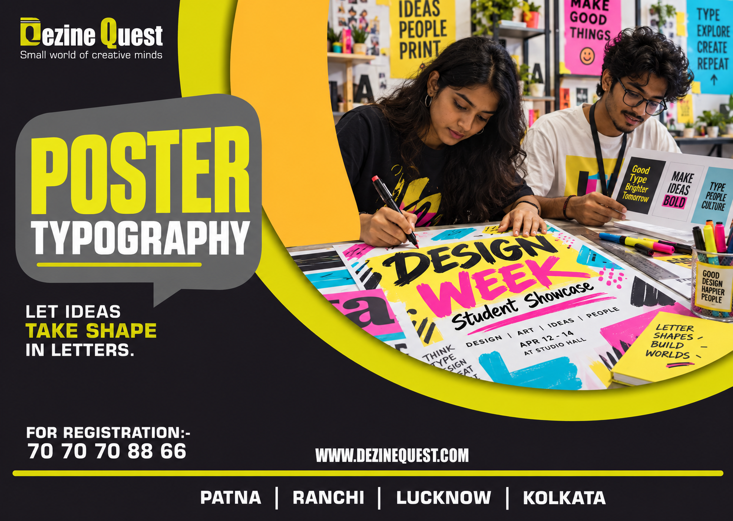
For example, a fictional exhibition poster might prioritise 'DESIGN WEEK', followed by 'Student Work Showcase', then the date, venue and entry information. If the venue dominates the page, viewers may miss the event itself.
Exercise 1: Use Only Three Levels of Text
Choose a fictional event and write its details in a notebook. Design the poster using only three text sizes: headline, secondary information and practical details. Avoid adding decorative text just to fill empty space. Ask a friend to look at the poster for five seconds and tell you what they remember. If the main message is not recalled, revise the hierarchy.
Headline: the single most important message.
Secondary line: context that explains the headline.
Details: time, place, contact or action, kept readable.
Exercise 2: Learn Contrast Without Using Colour
Create a black-and-white poster using one lettering style. Make the headline bold, the subheading medium and the details lighter. Try placing dark text on a light background, then reverse the contrast in a second version. Compare which arrangement remains readable from across the room. This reveals whether the hierarchy depends on structure or merely on bright colour.
Exercise 3: Work With Alignment
Draw three versions of the same poster: left-aligned, centred and asymmetrical. Keep the wording identical. Left alignment can make multi-line details easier to scan, while centred text may suit a short ceremonial announcement. Asymmetrical placement can create energy, but it needs intentional balance. There is no universal 'best' alignment; the audience and amount of information matter.
Exercise 4: Make Space an Active Design Element
Leave generous space around the main headline. Group related details together, such as date and time, while separating unrelated sections. This is proximity: items placed near each other appear connected. A poster can look more professional after removing an unnecessary box, icon or slogan than after adding another decorative element.
Exercise 5: Test Readability at Different Sizes
Sketch a poster on A4 paper and photograph it. View the photograph at a small size on a phone. Can you still identify the headline? Can you find the venue without zooming? A successful poster does not require every line to be equally prominent, but essential information must remain discoverable. This exercise also helps when creating social media graphics.
Exercise 6: Use Lettering to Match the Message
Try a friendly rounded headline for a children's art workshop and a more restrained lettering style for an academic design seminar. Compare how the same words feel in different treatments. Typography influences tone, but avoid stereotypes and unnecessary flourishes. If the chosen lettering makes the message difficult to read, the style is not serving its purpose.
A Sample Poster Brief: Sustainable Campus Day
Brief: Announce a fictional student event about reducing single-use waste. Required details: event title, short purpose, date, time and location. Audience: college students. Constraint: one illustration, two lettering styles and no more than three levels of text.
First draft: place 'SUSTAINABLE CAMPUS DAY' at the top, a simple reusable-bottle illustration below and the practical details at the bottom. Second draft: place the illustration to one side and use a large left-aligned headline. Compare both using a five-second recognition test. Record what viewers notice first, what they overlook and how you could improve the design.
A Seven-Day Typography Practice Routine
Day 1: Redesign a cluttered fictional announcement using three text sizes.
Day 2: Create two monochrome hierarchy studies.
Day 3: Compare three alignment systems.
Day 4: Experiment with spacing and grouped information.
Day 5: Test the same poster at print and phone-screen sizes.
Day 6: Create two mood variations using lettering.
Day 7: Present your strongest poster and revise it from feedback.
Save both the first and revised drafts. The comparison shows how a design decision improved communication, which is more useful than simply producing another polished image.
Common Mistakes in Poster Typography
Using too many typefaces or decorative lettering styles.
Making every line equally large or bold.
Placing important information on a low-contrast background.
Using excessive effects instead of clear spacing.
Designing only at full size without checking small-screen readability.
Forgetting that the poster must communicate to an audience, not just impress its creator.
How Typography Practice Fits Design Entrance Preparation
Poster typography develops composition, prioritisation and visual communication. It can be a useful part of design aptitude test coaching and a drawing and design course. Students should combine it with the other relevant areas in the current official syllabus rather than treating poster design as the whole exam.
Dezine Quest's published online-course outline includes 'Poster’s Design and Typography' within its design aptitude and creative ability content, alongside logo design, composition, observation and other skills. Students exploring design entrance coaching for beginners can ask for assignments that include critique of clarity, hierarchy and readability.
Learn about online classes: https://www.dezinequest.com/online-classes.html
Explore Dezine Quest: https://www.dezinequest.com/
Frequently Asked Questions
Do I need expensive fonts or design software to practise typography?
No. Start with pencil lettering, paper and simple layout grids. Software can be introduced later when you are comfortable with hierarchy and spacing.
How many fonts should a beginner use?
A useful practice constraint is one or two complementary lettering styles. The goal is to make differences in importance clear, not to collect font styles.
Is typography only relevant to graphic design?
No. Clear visual communication matters in signage, product instructions, presentations, interfaces and many other design contexts.
Will NIFT or NID definitely ask for a typography poster?
No specific task is guaranteed. Review the current official information and use these exercises to develop transferable design skills.
What is the fastest way to improve a cluttered poster?
Identify the main message, reduce competing elements, group related details and retest readability. Removing distractions often helps more than adding decoration.
Conclusion: Design the Reading Order
A strong poster guides the viewer from the main idea to the supporting details with minimal effort. Practise three-level hierarchy, contrast, alignment, spacing and small-size testing. With consistent revision, typography becomes a way to solve communication problems rather than simply decorate words. Explore Dezine Quest's current design entrance preparation options if you would like guided feedback on poster and visual communication exercises.